How to Choose the Perfect Font for Your Book Cover
You know that old saying about not judging books by their covers? Well, it’s now time to think otherwise. With over a million books hitting the market every year, readers are absolutely judging your cover — and they’re doing it fast.
When someone’s browsing (whether online or in a bookstore), your cover has mere seconds to communicate what your book is about. It needs to signal genre, tone, and quality before a reader even picks it up. Fonts play a major role in that first impression: the right typeface can instantly tell a romance lover they’ve found their next read, while the wrong one can make your book look amateurish and push readers away before they’ve read a single word.
So how to choose the perfect font for your book cover? In this post, I’ll dive into the essential elements that will make typography work in your favor.
1. See what aligns with your genre
Every genre has its own “look,” and if you stray too far from what readers expect, you’re going to confuse people. It’s not about being boring — it’s about speaking the visual language your audience already understands.
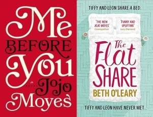
Take romance novels. Walk into any bookstore and you’ll spot them instantly: cursive or flowing script fonts, lots of curves. These fonts practically scream “feelings ahead!” — and that’s exactly what readers of romance books, like Jojo Moyes’s Me Before You and Beth O’Leary’s The Flatshare, want to see.
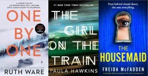
Thrillers are the exact opposite. Think sharp, all-caps, sometimes a bit aggressive — see the covers below. The font should make you feel slightly on edge, like something’s about to happen. The US hardcover of Paula Hawkins’s The Girl on the Train does this perfectly, with its “double text” or “ghosting” effect — looking at the title makes you feel like something’s off, a visual representation of themes like confusion, mystery, and distorted perception.
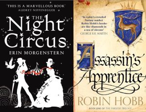
Fantasy and sci-fi designers arguably get to have the most fun here. Their covers can go wild with custom lettering that looks like it belongs on another planet or in a medieval manuscript. Some of my favorite book covers with standout fonts include Erin Morgenstern’s The Night Circus and Robin Hobb’s Assassin’s Apprentice.
No matter what, the trick is to find the balance between “Yup, that’s definitely [genre]” and “Hmm, but this one stands out from the rest.” Too familiar and your book becomes invisible next to all the others. Too weird and people won’t even realize it’s the genre they want!
2. Match your font’s emotional vibe to your book’s content
Beyond genre conventions, your font also has to capture what your book is actually about. Think about the emotional journey you’re taking readers on. Is your story hopeful or dark? Funny or serious? Intimate or epic? Your font should hint at these qualities via your book cover before anyone reads a single word.
Take trustworthiness, for example. If you’re writing a self-help book or business guide, you’ll often see fonts like Helvetica Neue or Garamond on the covers. Helvetica Neue is crisp and clean, giving off a modern, no-nonsense vibe, while Garamond’s classic serifs signal reliability and experience. Both fonts tell potential readers: “Hey, you can trust me.” That subtle credibility goes a long way when someone is deciding whether to take a chance on your work.
For books that are a bit more playful, fonts like Gotham Rounded or Avenir Next Rounded are common choices. Gotham Rounded has friendly curves that’d make your cover feel approachable and fun, while Avenir Next Rounded balances clean, modern lines with a warmth that’s inviting and readable.
Sometimes, however, the magic happens when the font and the imagery are NOT on the same page. Take Bunny by Mona Awad: the cover features a cute silhouette of a peach-pink bunny. But then you get smacked with the title: uneven letters that look scrawled in a moment of manic energy, in a hot-pink shade that totally clashes with the silhouette.
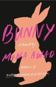
This mix of sweet and unhinged tells you this book isn’t just sugary fluff: there’s something darker and weirder lurking under the surface. It’s a perfect reminder that sometimes having clashing vibes can make your cover more intriguing.
3. Use a font everyone can actually read
This might sound obvious, but you’d be amazed at how many covers I’ve seen where the title is very difficult to read. I get it — you might want a gorgeous, intricate font that perfectly captures your book’s vibe. But if readers can’t read it immediately, all that artistic vision is wasted.
Think about it this way: when you’re browsing Amazon, book covers are tiny little rectangles. That delicate script font that looks amazing on your computer screen? It might shrink into unreadable nothingness at thumbnail size.
Also, resist the urge to use fonts that require a decoder ring. Yes, that ornate medieval font might perfectly capture the essence of your historical novel — but if people have to squint to figure out what it says, they’re just going to keep scrolling. The same goes for font overload: too many different typefaces can make your cover feel chaotic and confusing, driving readers away.
Here’s a tip to save you from font disasters: print out your cover at actual book size and stick it on the other side of the room. If you can’t easily read the title from there, neither can someone walking past a bookstore display, or looking at thumbnails on Amazon.
Here are some examples of book covers that I think do both font type and size very well, from Alex Michaelides’ The Silent Patient to Madeline Miller’s Circe.
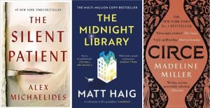
Sometimes, the fix is simple (a bolder version of the same font; a slightly larger size; etc.). Small tweaks, after all, can make a huge difference.
4. Don’t forget the practical stuff
Okay, this isn’t as fun as picking pretty fonts, but trust me — the practical stuff is important!
First off, check what variations your font actually comes with. Nothing’s more frustrating than falling in love with a font only to discover it doesn’t have bold or italics. (Some font families are like those fancy kitchen gadgets that only do one thing — they look great, but leave you stuck when you need flexibility.)
Another thing to keep in mind (and avoid!): potential licensing issues with fonts. Just because you can download a font for free doesn’t mean you can legally use it on a book cover you’re selling… so always do your research.
And finally, here’s something I’ve learned from watching book covers and other graphic designs age poorly: today’s trendy font is tomorrow’s “What were we thinking?” moment. Consider, for example, that two-toned “dramatic” font that had a moment in the 2010s. It worked well for books at the time, but unfortunately, this sort of font looks a bit dated now:

(Sorry, Divergent!)
So when choosing your own font, you might be tempted to go “trendy” — but try to resist. Instead, go with something that has staying power.
5. Get a second opinion (or third, or fourth)
Here’s one more uncomfortable truth: you’re probably too close to your own cover to judge it objectively. After staring at font options for hours, everything starts to look terrible, and your perception gets completely warped.
This means you need to get input from other people besides yourself. When asking for thoughts, look for people who fit your target audience… but also, people who don’t. Your thriller-loving friend might give great genre feedback, but your romance-reading coworker might be the one to notice that your font doesn’t look “serious” enough.
Also, if you want a cover that stands out, be as specific as you can about what you want to know. Don’t just say “What do you think?” Instead, try:
“Can you read the title and other text easily?”
“What genre do you think this book is?”
“Without any context, what do you think this book is about?”
You’ll get much more useful answers that way. And yes, sometimes the feedback might sting a little — but I think we can all agree, it’s better to hear that criticism before your book goes live, when people will be complaining (very publicly) in your Amazon reviews.
Remember, your book has something unique to offer readers. Make sure your font choice helps them discover that, instead of unintentionally hiding it! The right typography won’t make a bad book good, but it can definitely help a good book find its audience — so don’t disregard its vital role in the design process.
(c) Savannah Cordova
Savannah Cordova is a writer with Reedsy, a marketplace that connects authors with resources and professionals to help them publish beautiful books. In her spare time, Savannah enjoys reading contemporary fiction, writing short stories, and analyzing literature into the ground.
See here for more articles from Savannah on Writing.ie.